
Those of you who pay attention might remember that, way back in April, Auld Reekie Roller Girls were shortlisted for the People’s Projects funding, with one of their goals being to rebrand to a more inclusive name.
Auld Reekie certainly haven’t forgotten, and with the launch of their new identity today, we’ve given them the spotlight to talk about their reasoning and process leading to this launch:
Why Rebrand?
We’re not the first league to do this, and I’m pretty sure we won’t be the last, but we’re finally (the vote was a while ago!), officially, publicly rebranding from ‘Auld Reekie Roller Girls’ (ARRG) to Auld Reekie Roller Derby (ARRD).
The reasons behind the change are simple – our members wanted a name to reflect our diverse membership and support our ethos around equality and inclusion.
All Star skater and Equalities Team member Mallory Powers shared thoughts on the rebrand: ‘We believe in the power of sport to change lives – roller derby can help improve physical and mental wellbeing, boost self-esteem and give people a sense of belonging – and we want more people to have the opportunity to experience this for themselves. By rebranding, and through promotion and outreach, we hope that more people will see a place for themselves in Auld Reekie Roller Derby.’
From now on, we’d like to be referred to as Auld Reekie, and our acronym is ARRD.
The choosing of the name was surprisingly painless, a simple discussion and almost unanimous vote, and as summed up by skater, Lady Scrapnell, ‘It’s a win for inclusivity, equality and humanity, but it’s a sad loss for punnage’. [SRD’s note: we can think of plenty of “ARRD” puns, so we’re not sure this is the case.]
Anyone who’s been through this process will know that organising a wholesale change of name, logo and brand takes a lot of work on top of keeping a Roller Derby League running smoothly. With around 120 members, 3 travel teams and a host of new recruits, it’s also not cheap to rebrand! Thanks to some amazing support from the community who voted for our pitch to access National Lottery ‘People’s Project’ funding this year, we were awarded a runners up prize of £5,000 and finally had the money, people resource and time to get things organised.
Through the exposure with the campaign, we were contacted by a local designer Emily Horgan who loved the values and ethos of our league and generously offered her services for free! So began the process to really look at our values, our aspirations and our vision and to get ideas from our members to build some concepts. ‘If you’re going to rebrand; why not go the whole hog and design a whole new look’, we thought.
Building Concepts
Our league members sent in all of their thoughts and ideas about the look and feel of the logo, team shirts, design concepts, branding and we gathered up some keywords to focus us:

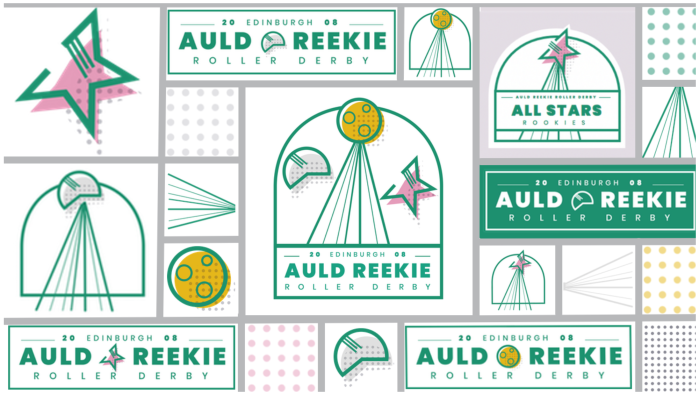
Revealing the New Look!

The main logo – it’s super adaptable; we wanted to be able to pull it apart to create recognisable mini marks (some are already in evidence on our current Taster Day advertising – sneaky sneak preview!)
The three entities represent our community (the three travel teams, and the three different paths you can take to become a skater, official and volunteers).
The look and feel really reflects the galaxy vibe we’ve been using on our game poster designs for the last couple of years, and sits really well with our travel team names – the All Stars, All Star Reserves and ASTROs. We also loved the idea of unexplored territory, taking bold steps and reaching for the stars.

Font Version – we love the boldness of this, it’s simple and recognisable
We dramatically revealed the new logo, with awkward tabletop drum rolls and much build up at the league AGM in September and never has anyone been as nervous, excited and shaky knee’d as the rebrand team on that day! Thankfully everyone has been enthusiastic (apart from newborn baby Scrapnell who burst into tears at the moment of revelation – we’ll take that as tears of joy) and we cannot wait to see our new team shirts, due to be ready for the 2019 season.
Astro Bench Coach Jodie tells us, ‘Now we have a look and branding that represents the professionalism and fun we live on a daily basis as a league.It represents us, and the element of fun which is vital to keep our motivation high. It’s a strong and professional branding. It’s revolutionising our approach to our image and the message we send out to potential team members, officials and audience. It’s fit for purpose in terms of bringing us together as one unit ready to take on the world.’
What happens next? We’re holding an exciting 5 team tournament on November 17th with 3 teams coming from mainland Europe to play our All Stars and ASTROs in a giant celebration of our new league branding – what better way to celebrate than by playing roller derby?
We’d like to take this opportunity to say a huge thanks to our designer pal Emily Horgan for creating such a wonderful look and feel to our new branding, and we can’t wait to get our hands on the amazing new look Auld Reekie merchandise.
Auld Reekie are also moving their website URL, and updating their Facebook page in concert with the rebrand.
You can find them at http://auldreekierollerderby.com/ from now on, and on Facebook at https://www.facebook.com/pg/auldreekierollerderby/ (their other social media links, and email addresses have also migrated as you would expect).
Auld Reekie’s first event under their new branding and name is in just two weeks, as they face international competitors in Close Encounters of the ARRD Kind! This mighty quadruple header sees ARRD A and C facing teams from Helsinki, Lille and Vienna to end the year on a high!
ARRD’s new brand was designed by Emily Horgan, who you can find on instagram at: https://www.instagram.com/emilynorarose/
